Photographing Pleione
- seantrepail
- Feb 23
- 2 min read
It makes me blush a little when I get really nice comments about the photos I take of my plants. Having a photographic record of plants is important to me for several reasons - I can compare year-on-year flowers if I suspect there may be an issue, I can identify plants where labels may have gone astray over winter and possibly most enjoyable is the fact that I can share the pictures of the plants with growers around the world.
I am asked how I take my pictures and how I make sure that the colour saturation in the images is as close as possible to the real plant, especially if the flower is a vibrant red or purple, or even a vivid eye-hurting yellow. I am sure we have all had experiences where we take photos and the colour in the image does not do the flower justice.
So, about three years ago I built myself a little photo studio in my greenhouse, it only measures 40cm x 40cm and folds up when I am not using it, all of my photos are taken using that. My camera is nothing fancy, a Canon 90D with a 105mm Macro lens for flower photography, all this is set up on a tripod to keep shake to a minimum....
Here is the slightly more fiddly technical bit for making sure that flower colour is represented as closely as possible. Before I start taking the main photos I take a couple of 'calibration' photos, and to do this is really easy and only requires a quick (and free) trip to your local paint supplier. I get a selection of the paint sample cards in various shades - reds, purples, yellows and such, just as in the image below, which I got today...

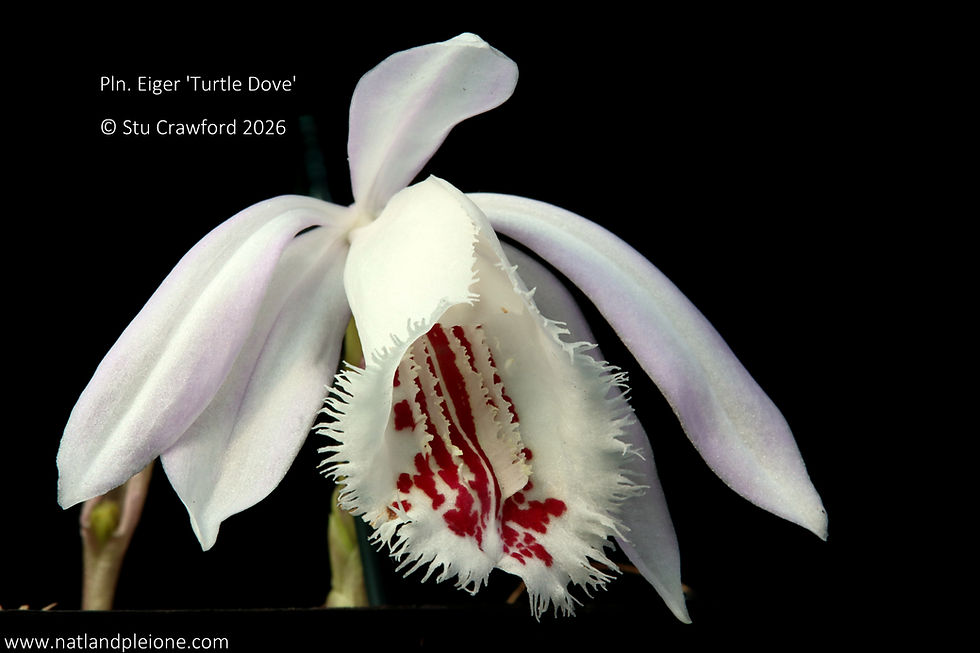
Once I have the cards I take the 'calibration' shot which involves the plant to be photographed (with its name label visible) and the colour card closest to it, for example looking at the photo above I might select the vivid red card (Scarlet Tanager - 2nd from R in the image above) when photographing Pln. Michael Butterfield 'Red Kite' or Sunset Crater 'Red Crossbill' (see below) and proceed to photograph the plant and card together in the same frame.


Once I get back to my PC and upload the photos I compare the colour of the card in the image to the colour of the same card in my hand - voilà! you have a compare and contrast situation. If the card in the image is much different to the card in your hand you can then, using one of the many, free and often simple to use editing suites to correct the colour saturation (I use Picassa).
Once you have got the hang of doing this it only takes a few moments to make any adjustments needs to ensure that your photos really show of the beauty of the flowers, and you can confidently tell people that 'yes, it really is that colour'....
Happy growing
Stu

Comments